top of page
Owleyes Bath Shoppe branding
Objective: Create a consistent and recognizable brand for Owleyes Bath Shoppe that showcases the silly and creative personality of the business owners. Leverage this brand across product brand names, labels, and packaging.
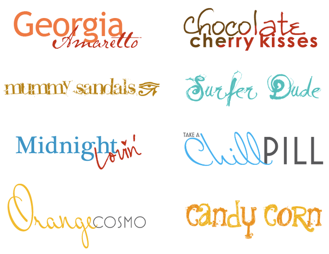
Solution: The Owleyes logo represents an owl and an eye in a very simplistic, abstract fashion. This was accomplished by creating a symbol using two organic lines to represent an owl, and utilizing the “O” in Owl for the eye. To compliment this logo, various typographic treatments were done for the available scents, which were incorporated into the product packaging. The product photography had a particular style with creative angles to highlight the owners’ personalities.

bottom of page


